I have been designing since the early 80's, after graduating from Drexel University in Philadelphia. Back then, computers were relatively new in the design community, but I was hooked on my mac. I concentrated mostly on environmental graphics (signage) and my sweetest job was designing the ride and directional signage for Hersheypark.
I now am responsible for most of the photoDUDS designs and email graphics.
I really love to paint rooms but found I needed an outlet that was a little more attainable, so I found ART JOURNALING.
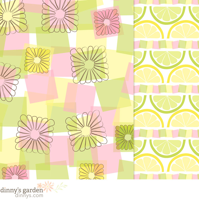
The pattern was designed with Adobe Illustrator CC’s pattern maker. The pattern maker still has the annoying issue of a 1 pixel white line grid that appears when copying the pattern into Photoshop! I must be the only one who does this and is not bothered by it! I kept brightening the colors from my original palette as I worked on the design. Lilla suggested a pale nugget color palette, but that just made me sad, so I stayed with the happy colors.
This is my final submission.
All of this snow and cold weather has me in a funk and I’m cranky. Not quite sure what I can do to get out of it?!?! There are dozens of excuses I could make, but that won’t really help. It is what it is and I need to move on.
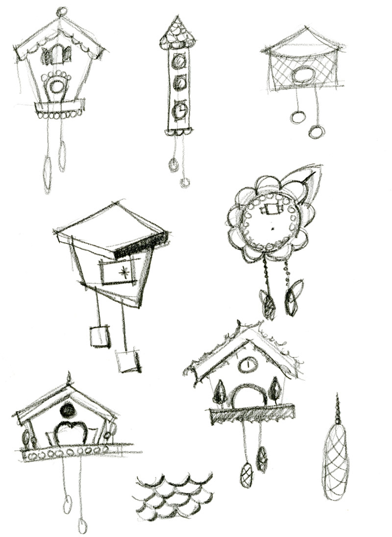
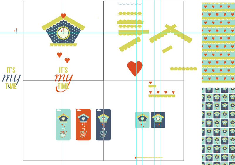
For February, Cuckoo clocks were the inspiration. iPhone case, was the assignment. On the first day BOOTCAMP went live, I read about the inspiration. All month long I would think about it, but I was SO busy creating things for photoDUDS, there was no time to do any cuckoo creating.
The facebook group page scared me, because this was my first time doing something like this. I wanted to stay true to myself and not “do what everybody else was doing”. Self doubt was not going to stop me.
On Saturday, I blocked out some time and finally read about the assignment. Doesn’t it figure! The assignment was DUE in a few hours. Even though I’m not much of a sketcher, but I forced myself. My mind is ALWAYS thinking and seeing designs ALL of the time. It won’t stop! I pencil sketched various thoughts I had throughout the month.
dinnys garden cuckoo sketch
Ink drawings and watercolors, that’s what I’ll do! However, I had too much DUDS stuff on my table to move, so off to the computer…
Color schemes are where I typically start. The inspiration image came from one of Lilla’s bootcamp posts. When creating a color scheme, I use Photoshop’s COLOR PICKER to select colors from my image, and dump the colors into lots of boxes. NOTE: Do this on a layer ABOVE the inspiration image, so it’s easier to adjust the colors to my liking. Even after doing this, the colors will get tweaked while working on a project.
In Adobe Illustrator, I started to draw the basic shapes, starting with the roof. While drawing in Illustrator, I have learned to save everything in bits, because you will always want to go back and change things later. My Illustrator desktop tends to look like this.
Illustrator desktop | cuckoo
I’m an old school Illustrator user, since it was first developed in 1988 – they used to name the software by year back then. There are probably ways to do this better or more efficiently, but it’s what I’m used to and that works for me. The dot pattern to the clock body bothered my how the dots lined up or rather didn’t line up nicely, so it was edited out. Patterned papers were designed, but they didn’t thrill me.
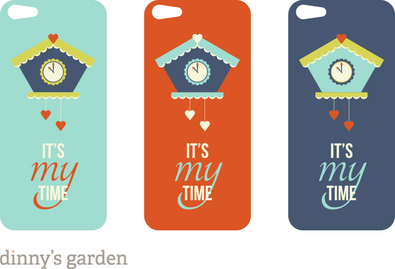
The illustration was intended for use on an iPhone. Since the image would end up around 2″ wide, I didn’t want the details to get lost, so it remained simple.
Here’s my submission:
It made me smile and my daughter like it. I’m not sure my style is fitting in with the other artist type of work, but I need to be true to myself. After submitting, I wish I had made some changes {of course}! These designs may get worked into a few more options, but not sure. That all depends on what the next assignment is.
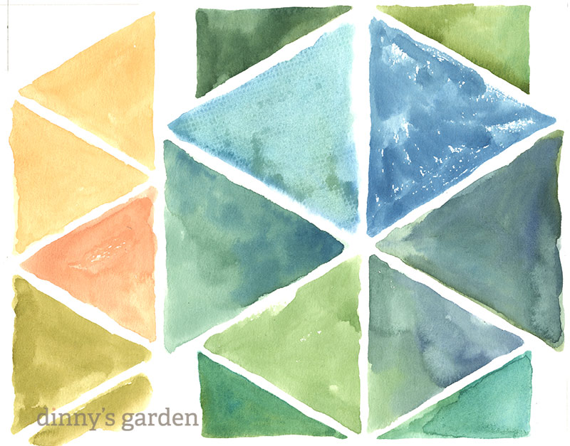
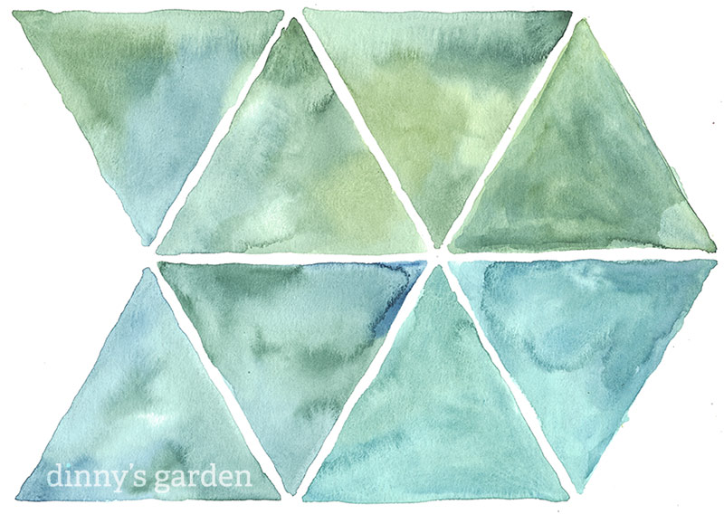
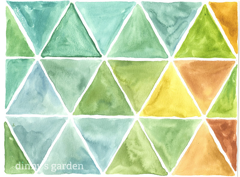
I like to incorporate real watercolors into my digital designs. It gets me away from the computer {for a short time} AND I can get messy. My initial inspiration for this product was a repeating triangular shape. I didn’t have any real color scheme in mind because I figured I could make it whatever colors I wanted later in Photoshop.
I drew a hexagonal shape with pencil on my watercolor paper and started painting. I couldn’t let that extra space go to waste, so I drew parallel lines on and figured I could fit a few smaller triangles. What was I thinking, I could totally be more efficient in my use of space! So I did a little math and tried this.
I really liked the direction this was going. But, I could get MORE triangles from a sheet of paper if they were smaller. So I did these.
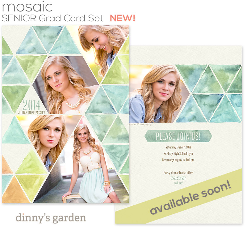
I really started to like the colors. I did a few more sheets of triangles, in similar colors. Some of the triangle I did not like – but that’s what Photoshop is for. I erased the pencil lines before scanning. Here is the photoDUDS card I created with these watercolor triangles. I removed some of the triangles with a mask in Photoshop.
MOSAIC, senior grad cards will be available in the photoDUDS store on Thursday. There are 8 different designs in the set, all with similar water color designs. I also painted some squares.
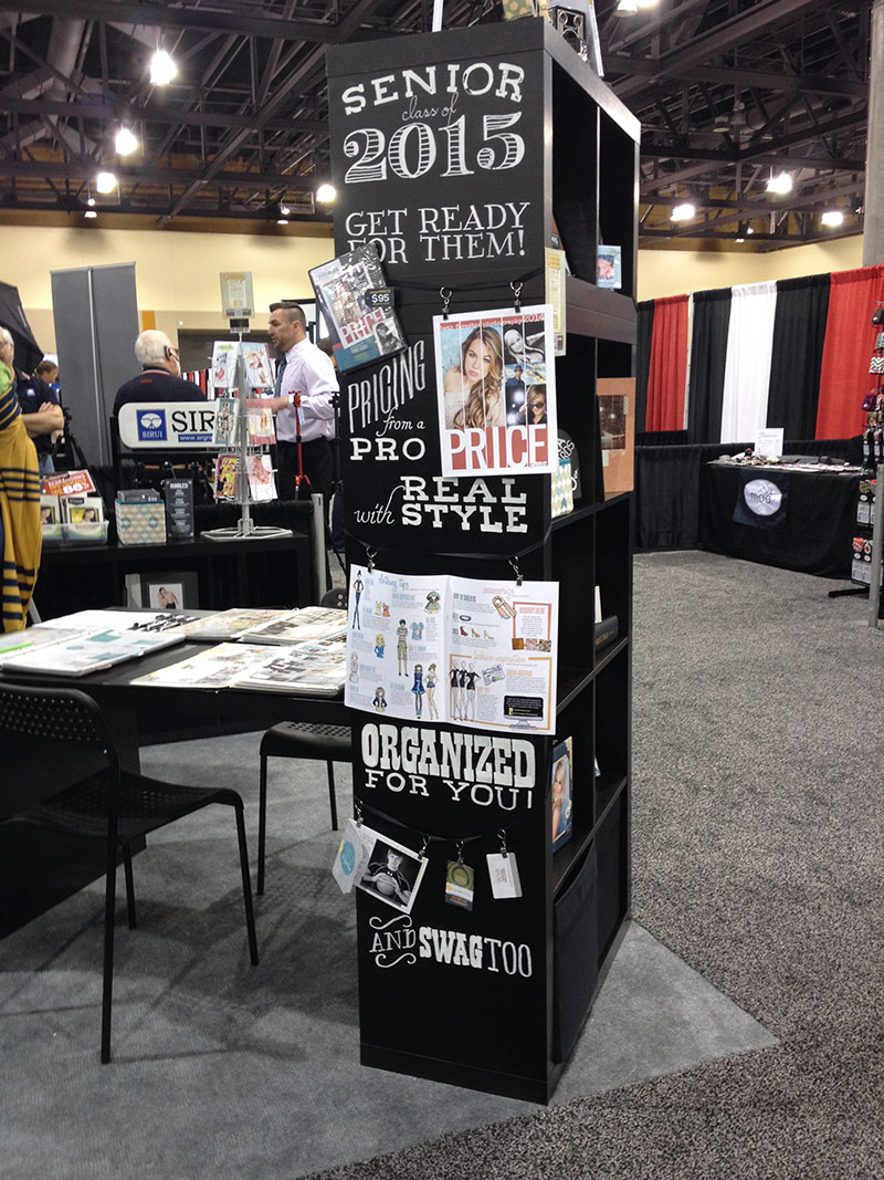
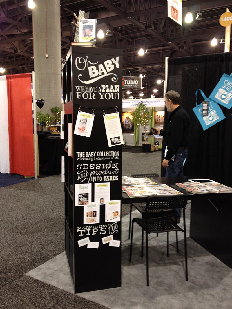
So, I’ve been back from ImagingUSA for a week. I finally feel like I’m getting caught up on all those little things that didn’t get done before the show.
Despite of our booth and DVDs showing up on the last day of the show, I think what we put together in a hurry worked really well – thanks to IKEA and some quick planning on our part! Fortunately, weeks before the show, we did plan to buy 1 IKEA Expedit bookcase and hand letter the sides. The night I arrived in Phoenix, we planned an entire booth around that bookcase.
I designed the type and product layout prior to the show. I printed out full size versions of the type and brought that with me. I used Chalk Ink Markers because they make less of a mess than real chalk, would not just rub off is someone brushed against it and could easily wipe off with water and a wet rag. I traced the letters onto the cabinet with chalk, then used the markers for the final type. After doing the first section of lettering, the Chalk Ink Markers started to chip off. I panicked, but figured it just gave it a real hand lettered look. For some odd reason, the cabinet on the top, must have had a different finish because the markers did not chip off of the lower unit.
I was really happy with the results. This is how the lettering turned out.
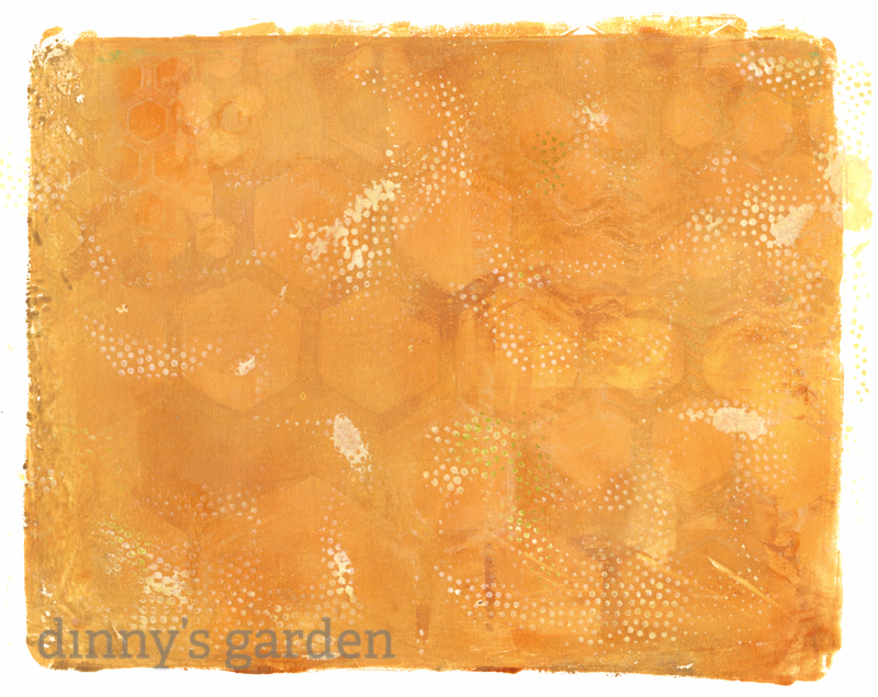
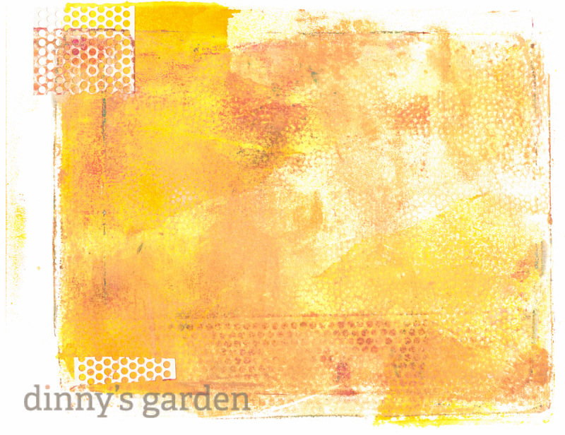
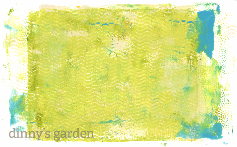
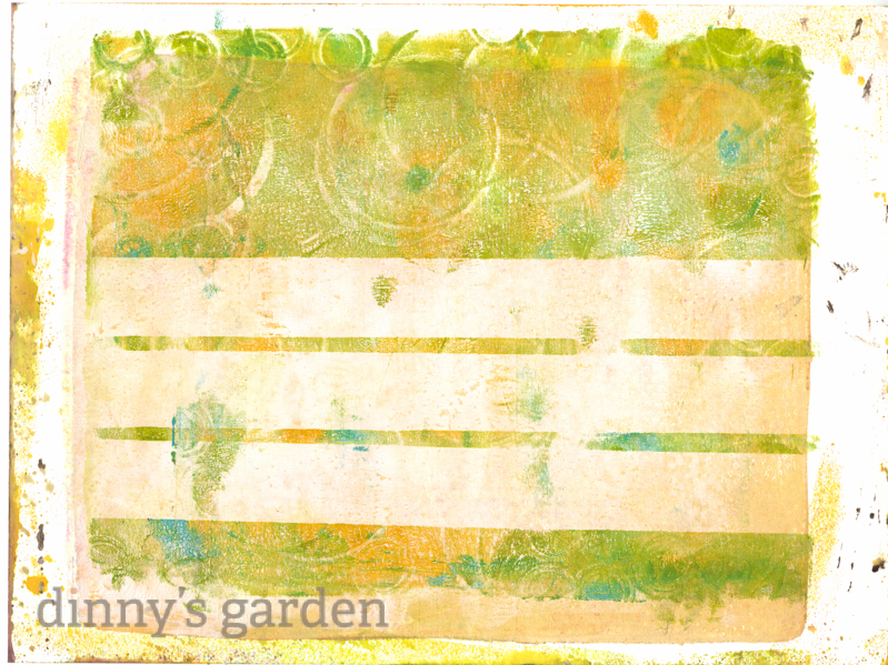
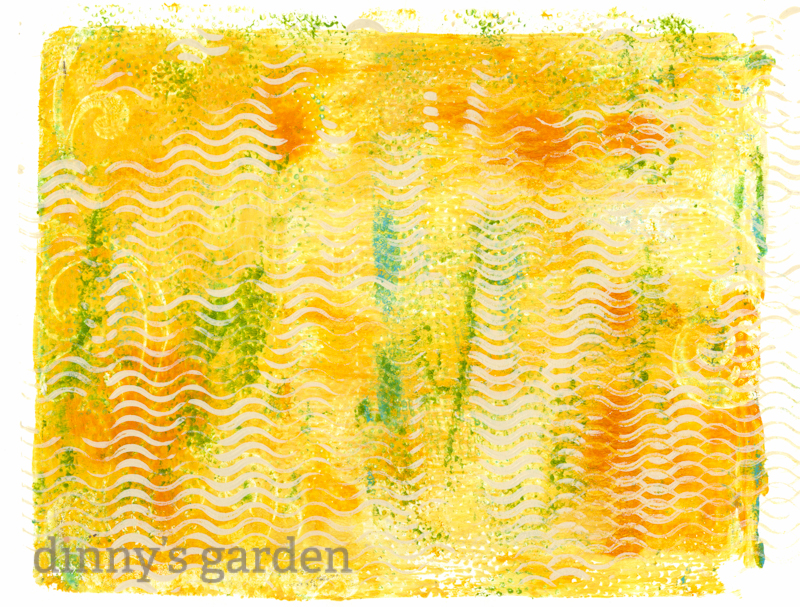
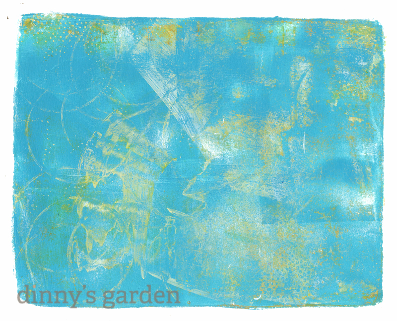
I pulled out my Gelli plate and made some prints. These Gelli Arts Plates seem to be all the rage these days. Honestly, the first time I used the plate, I was not really happy with what I created. I felt like I should have saved my money on the plate. But, the more I play with it, the happier I am with the prints. I am learning to use more colors on the prints. Also, I like to go back over old prints later. Here are a few prints I pulled.
I used stencils, textured foam sheets and random round things. I keep struggling with what type of paints to use. The Golden Artist Colors paints are rather pricey, but I must admit, they blend very well and go on the plate nice and smooth. I tend to buy them one a time when I have a coupon (and right now Michaels has 50% off).
This one I used some holey joint tape on the plate. I couldn’t throw it away, so I added it to this print. This print was pulled at least twice.
To get the strips on this print, I laid some scrap of vellum on the plate before pulling the print. I now have some fun vellum strips to use elsewhere.
I really like this blue one! I don’t think it’s finished yet. I have some ideas of what to do to it digitally. We’ll see :)
I have TOO much fun making these prints, but I’m not quite sure what I will do with them. My box of scrap prints is getting full.